- February 11th, 2011
- Comments Off on Our New Menu

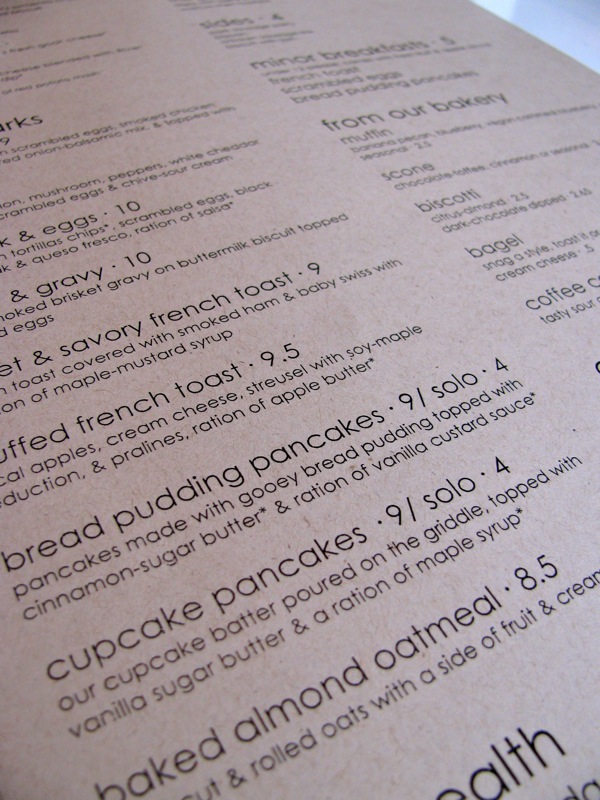
We were cramming, forcing all of our menu items into our old menu. We didn’t want to keep adding things, but it got hairy if we wanted to add a sandwich. There was a point where we had to move to something… well bigger.
That is where the new menu came in. First thing we wanted to do was get away from laminating – we didn’t want the waste, it took too much time, and we wanted a ‘cleaner’ look. Then for the layout, something with more interest, clearer categories, easier to read, a dressier font, a whole new look and feel. With that look and feel came new 100% recycled paper. We renamed a few things, moved items around, focused the descriptions – there was talk of cutting or adding, but there was little change in actual menu items. The new menu also allows for easier additions and subtractions to the menu, which filters to the kitchen being able to change menu items whenever they want.
Specials can be stapled on instead of being paper clipped, reducing waste and creating better focus. We love to add and try new things all the time – so the continuity of it being in the same place, same style and grace allows better focus. Have a critique for the menu? Love the new layout? Take a look at the PDF or in the menu section of our website. Let us know in the comments below, in store, or anywhere we are.
